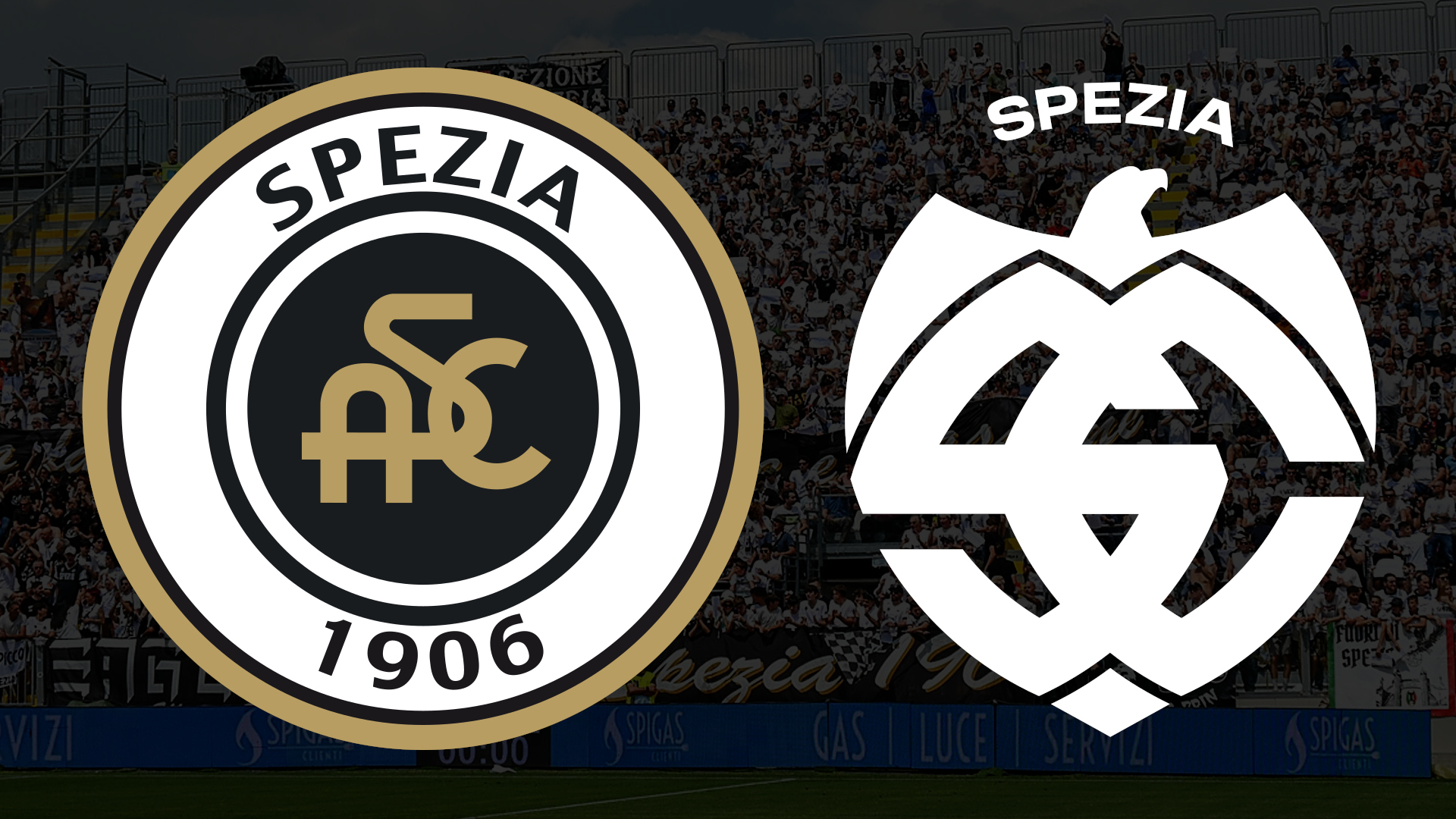
The city of La Spezia is angry. Not only politicians, trade unions, sportsmen and artists but thousands of citizens – supporters and non-ordinary citizens. Everyone (and not just from La Spezia) is against the new Spezia Calcio logo, presented yesterday on the club’s website. According to all of the protesters, the reference to neo-Nazi and fascist symbols is too striking. Tet stylized eagle, set in the club’s initials, was not liked. As for the change of letters from ASC to just SC, it is simply a question of the club’s official name (from Associazione Spezia Calcio to Spezia Calcio). However, black prevailing over white, the official colour of the shirt, has caused genuine disgust to many, so much so that they started a petition on change.org to force the club to revert the logo.The club made their case about the rebranding with a video in which all aspects of the new logo have been explained.
According to the club, the badge is composed of three constituent elements: the name “Spezia”, placed at the top of the logo, completing the structure’s geometry. It represents the name of the club. Then there is the eagle, historical symbol of Spezia Calcio, set in a dominant position in the upper part of the logo and, finally, the intersection of the letters S and C, representing the official name of the club, “Spezia Calcio”. The letters S and C, obtained from four geometric shapes inspired by the prow of a boat, a symbol of new horizons and progress, merge to form an anchor at the lower end, a symbol instead of respect and bond with tradition, all united in one shield. As the claim of the project states, the rebranding was conceived to look to the future, but with respect for tradition to create a visible and lasting identity.##NAJAVA_MECA_7359097##The new logo, white on a black background, aims to represent the city’s and its inhabitants’ strong maritime vocation, maintain close ties with the club’s past and evoke, with its sharp lines, the pride and grandeur of the eagle. It’s a nice story, but above all, the explanation is what people feel and think when they see the new symbol.Spezia logos through history La Spezia is a city which was active in fighting the nazis in WW2, so many feel aggrieved that their club’s new logo resembles something seen on a uniform belonging to a German nazi soldier.Is it me, or is the New Spezia logo giving me some vibes…? https://t.co/ZKZsJpGHzR pic.twitter.com/Y7ti9ASHZJ— Saturnion 🙂 (@saturnion13) July 7, 2023 Sometimes, being modern isn’t so good.